Color theory is a fascinating field that delves into the science and art of using colors to evoke emotions, create aesthetics, and enhance various visual compositions. With its roots tracing back to the works of great artists and scientists like Isaac Newton and Johannes Itten, understanding this theory allows one to harness the power of colors effectively.
Primary and Secondary Colors
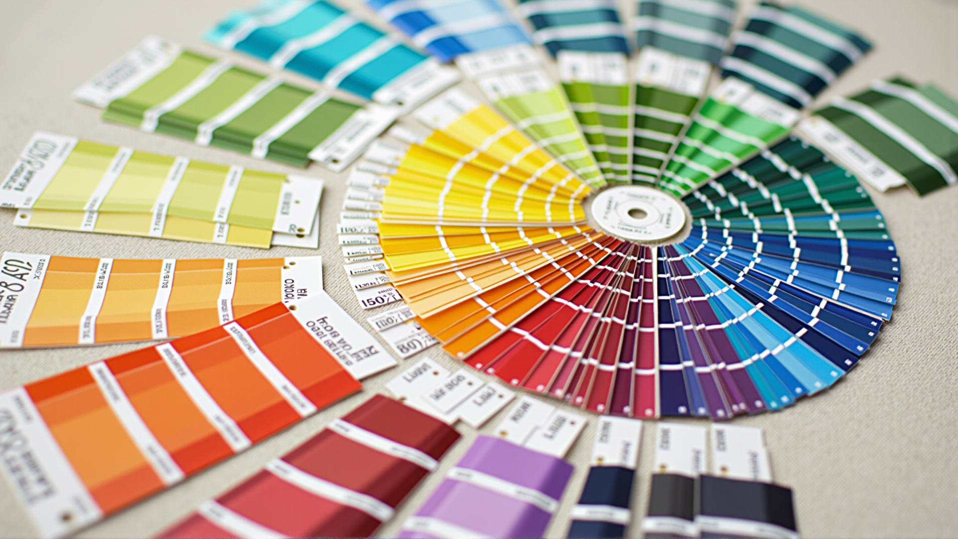
At its core, color theory begins with the primary colors: red, blue, and yellow. These colors serve as the building blocks for all other hues. By combining the primary colors, we form secondary colors: green (blue and yellow), orange (red and yellow), and purple (red and blue). This fundamental aspect is foundational for creating harmony and balance in any visual medium.
The Color Wheel
The color wheel, an essential tool in color theory, represents the relationships between colors. It is typically divided into sections that show primary, secondary, and tertiary colors. Tertiary colors are created by mixing primary and secondary colors, resulting in hues like red-orange and blue-green. The color wheel aids in visualizing how colors relate to one another and how they can be combined harmoniously.
Warm and Cool Colors
Colors are also categorized into warm and cool tones. Warm colors, such as reds, oranges, and yellows, are associated with energy, passion, and warmth. Conversely, cool colors, like blues, greens, and purples, evoke calmness, serenity, and tranquility. Understanding this distinction is vital for setting the right mood and tone in any visual composition.
Complementary and Analogous Colors
Complementary colors are hues that lie opposite each other on the color wheel, such as red and green. These colors create a vibrant contrast when placed together, making them suitable for drawing attention. Analogous colors, on the other hand, are adjacent to each other on the wheel, like blue, blue-green, and green. They often produce serene and comfortable designs due to their visual cohesion.
The Psychological Impact of Colors
Different colors can elicit varied emotional responses and associations. For example, blue is often linked to trust and professionalism, while yellow is known for inducing happiness and energy. Being aware of these psychological effects is crucial in crafting environments that evoke desired reactions from viewers.
Application in Various Fields
Color theory finds applications in numerous domains, from fashion to interior decoration. It plays a pivotal role in constructing visually appealing compositions that communicate effectively and persuade audiences. By choosing the right color combinations, one can enhance aesthetics and convey messages more effectively.
Conclusion
Understanding color theory is an essential skill for anyone aiming to create impactful visual narratives. It allows for the strategic use of colors to craft compelling visuals that communicate emotions and ideas. As you explore different combinations and experiment with various hues, you unlock the potential to transform any medium into a vibrant tapestry of expression.